suppressPackageStartupMessages({
  library(tidyverse) # reads in tidyverse package
  library(here) # reads in here package
  library(janitor) # reads in janitor package
  library(readxl) # reads in readxl package
  library(performance)}) # reads in performance package
# Stores the salinity data as an object called salinity
salinity <- read.csv(here('data',"salinity-pickleweed.csv"))
# Stores my personal data as an object called my_data
my_data <- read.csv(here('data',"193DS data - stress (5).csv")) Homework 3
Set-up
Problems
Problem 1. Slough soil salinity
You are working at a restoration site where you are managing planting of California pickleweed (Salicornia virginica) along a brackish slough (i.e. there is a mixture of fresh water and salt water).
You decide to measure plant growth for individual pickleweed plants by plucking an individual out of the ground and measuring the biomass (in g). You also measure salinity (as electrical conductivity in units of millisiemens per centimeter, or mS/cm) at the location in which the individual was growing. Admittedly, this isn’t a perfect study, but it’s what you can do with the time and resources you have!
a. An appropriate test
In 1-3 sentences, name the appropriate test(s) to determine the strength of the relationship between salinity and California pickleweed biomass (hint: there are two). Describe the differences between the two tests.
Be specific in your response to demonstrate your understanding of the variables in this question.
An appropriate parametric test is Pearson’s correlation coefficient (r), which assesses the strength and direction of a linear relationship between two continuous variables (soil salinity (mS/cm) and California pickleweed biomass (g)) assuming approximately normal distributions and independent observations. A non-parametric alternative is Spearman’s rank correlation (\(\rho\)), which evaluates the strength of a monotonic relationship using ranked values and does not require normality. These tests quantify how strongly variation in salinity is associated with variation in individual pickleweed biomass across the restoration site.
b. Create a visualization
Create a visualization that would be appropriate for showing the relationship between soil salinity (in mS/cm) and California pickleweed biomass (in g).
In addition to using the correct geometries, be sure to:
- relabel the x- and y-axes and include units
- use different colors from the
ggplot()defaults - use a different theme from the
ggplot()default
ggplot(data = salinity, # uses salinity data
       aes(x = salinity_mS_cm, # x is soil salinity
           y = pickleweed)) + # y is soil pickleweed biomass
  geom_point(color = 'magenta') + # changes color from default
  labs(title = "California pickleweed biomass vs. soil salinity", # creates title
    x = "Soil salinity (mS/cm)", # relabels x-axis
    y = "CA pickleweed biomass (g)") +  # relabels y-axis
  theme_minimal() # changes from default theme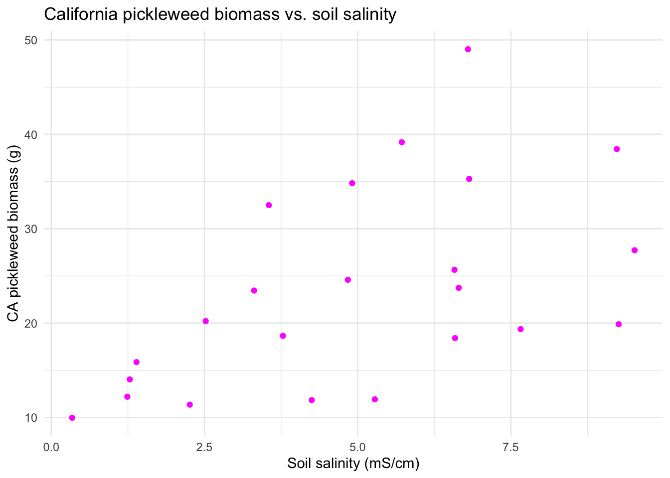
c. Check your assumptions and run your test.
In the order that is appropriate, create separate sections using subheaders to:
- check your assumptions
- run your test
In each section, write the code to check your assumptions and run your test as you see fit.
In the section in which you check your assumptions, write 1-3 sentences describing:
- which assumptions you checked
- how you checked your assumptions
- your assessment of your assumption checks
Part 1: Checking My Assumptions
# Assumptions:
#   1. Linear relationship between variables
ggplot(data = salinity, # uses salinity data set
       aes(x = salinity_mS_cm, # x-axis is salinity
           y = pickleweed)) + # y-axis is pickleweed biomass
  geom_point(color = 'magenta4', # sets point color
             alpha = 0.8, # sets point transparency
             size = 2) + # sets point size
  labs(x = "Soil salinity (mS/cm)", # creates x-axis label
       y = "Pickleweed biomass (g)", # creates y-axis label
       title = "Pickleweed biomass vs. soil salinity") + # creates title
  theme_minimal() # cleaner theme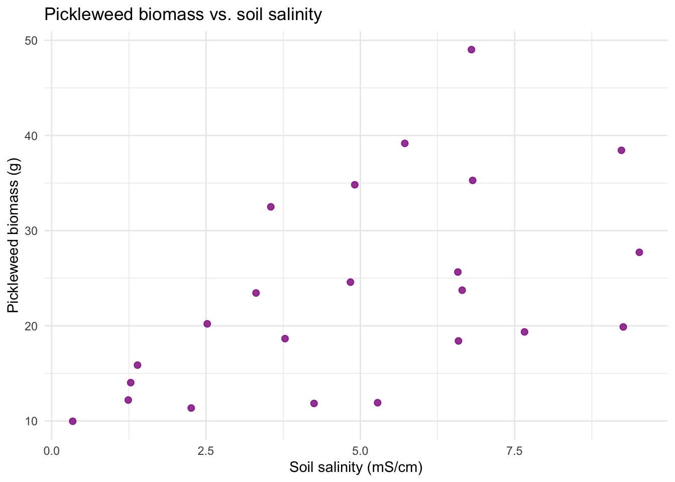
#   2. Variables are continuous
str(salinity) # confirm salinity_mS_cm and pickleweed are numeric (continuous)
'data.frame': 23 obs. of 2 variables:
$ salinity_mS_cm: num 6.58 9.23 4.25 9.26 0.34 6.59 2.26 3.31 1.24 4.91 ...
$ pickleweed : num 25.65 38.44 11.84 19.88 9.97 ...# 3. Variables are normally distributed (this is up for debate)
ggplot(data = salinity, # uses salinity data frame
aes(sample = salinity_mS_cm)) + # uses salinity_mS_cm variable
geom_qq_line(color = "green") + # adds green theoretical normal reference line
geom_qq() + # adds points
labs(x = "Soil salinity (mS/cm)", # creates x-axis label
y = "Count", # creates y-axis label
title = "Distribution of soil salinity") + # creates title
theme_minimal() # cleaner theme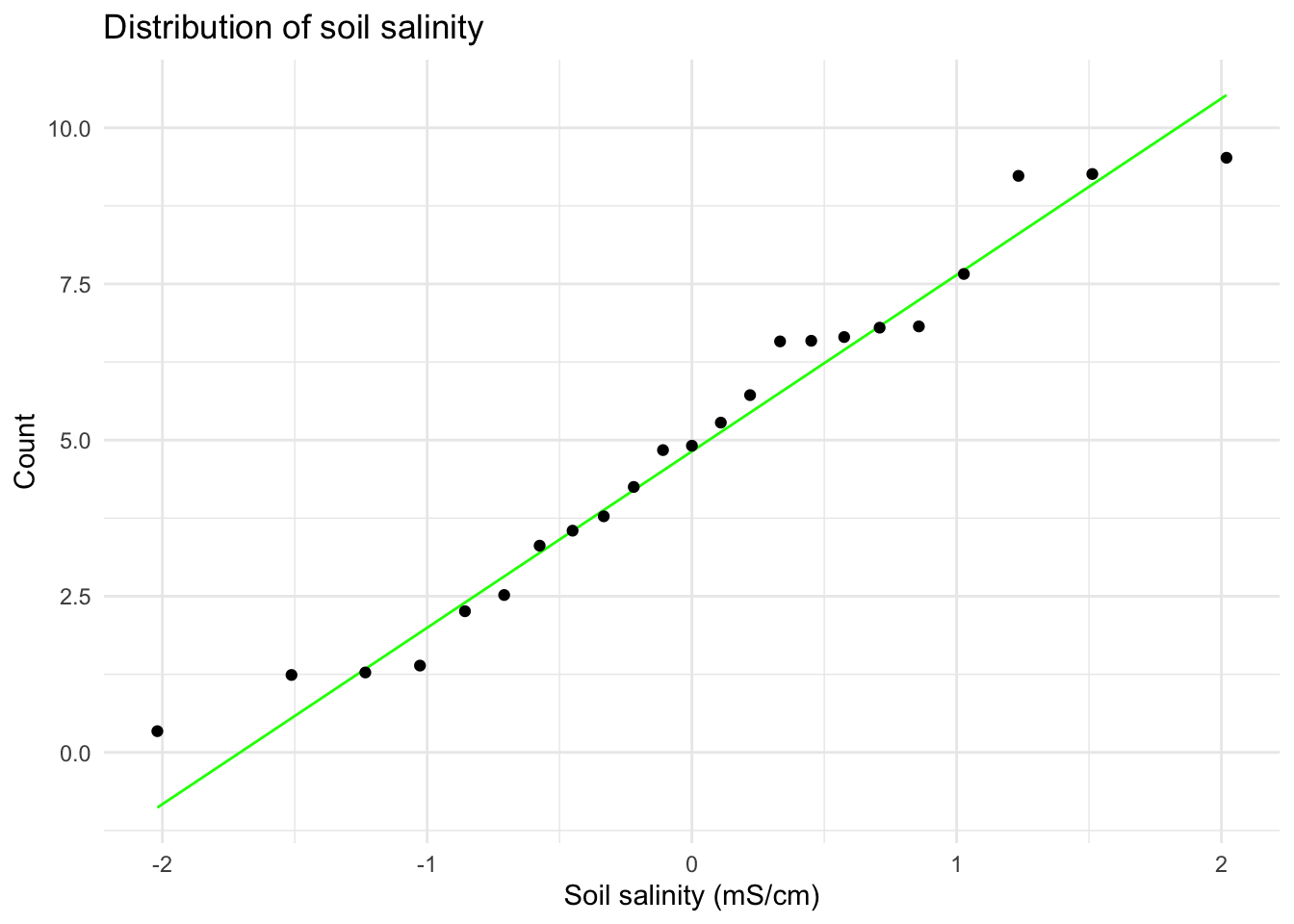
ggplot(data = salinity, # uses salinity data frame
       aes(sample = pickleweed)) + # uses salinity_mS_cm variable
  geom_qq_line(color = "green") + # adds green theoretical normal reference line
  geom_qq() + # adds points
  labs(x = "Pickleweed biomass (g)", # creates x-axis label
       y = "Count", # creates y-axis label
       title = "Distribution of pickleweed biomass") + # creates title
  theme_minimal() # cleaner theme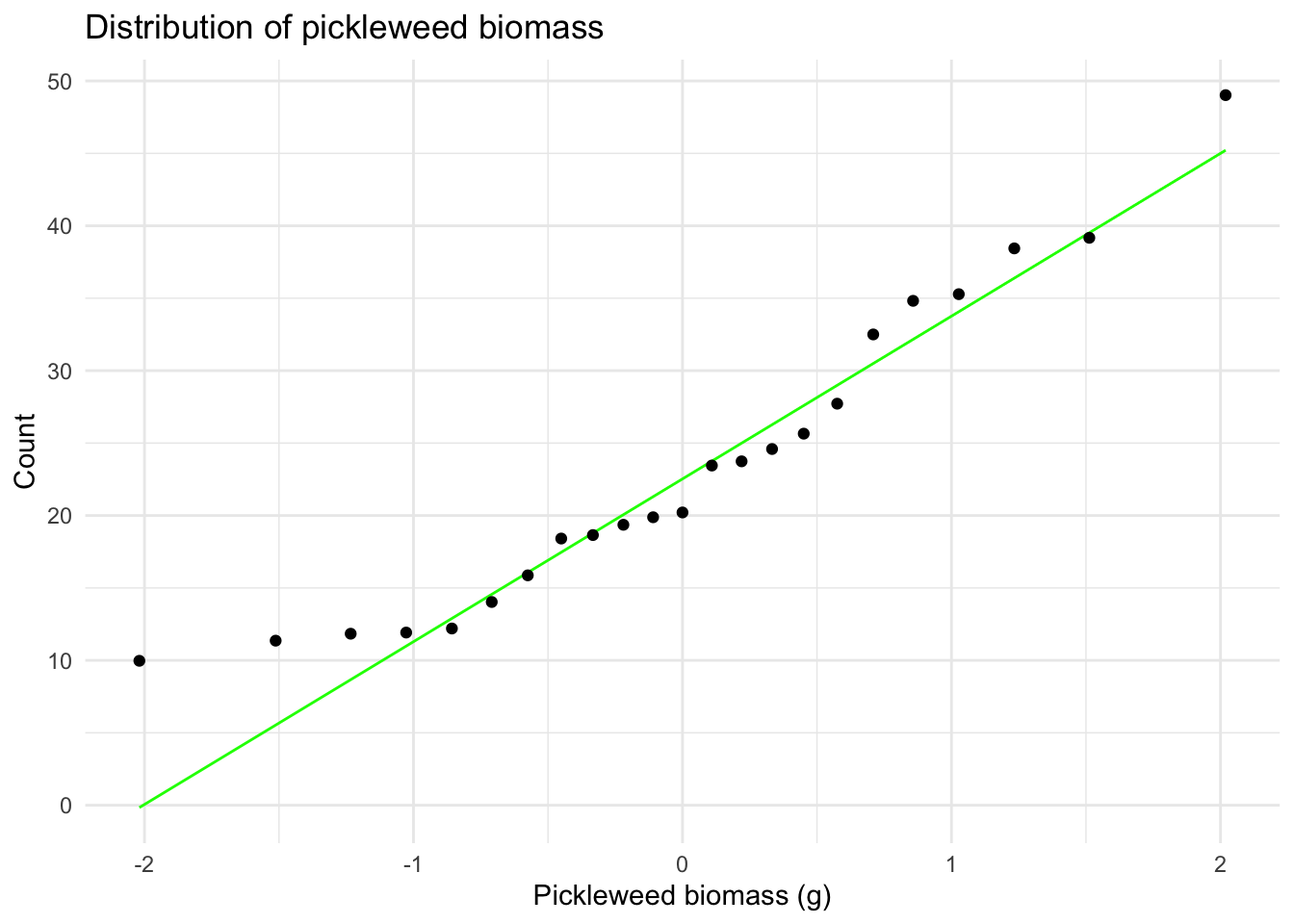
#   4. Independent observations: assumed because each observation
#      represents a different plant sampled once (no repeated measures)
I visually checked for the assumption of a linear relationship between variables using a scatterplot (appeared generally linear). I checked the Pearson correlation assumptions of continuous variable using the str() function (both variables are type nmumeric) and of normally distributed variables using Q–Q plots (points fall close to the reference line). Independent observations are assumed based on the sampling design (each plant measured once from distinct locations) so I concluded the assumptions for the Pearson’s r are reasonably met.
Part 2: Running My Test
# Parametric Pearson's correlation test
cor.test(salinity$pickleweed, # pickleweed biomass variable from salinity df
         salinity$salinity_mS_cm, # salinity variable from salinity df
         method = "pearson") # specifies Pearson (linear assumption met)
    Pearson's product-moment correlation

data:  salinity$pickleweed and salinity$salinity_mS_cm
t = 2.8979, df = 21, p-value = 0.008605
alternative hypothesis: true correlation is not equal to 0
95 percent confidence interval:
 0.1568265 0.7757682
sample estimates:
      cor
0.5344778
d. Write about your methods and results.
In 1-3 sentences each, write about:
- which test you used, and why
I used Pearson’s product–moment correlation to assess the strength and direction of the linear relationship between soil salinity (mS/cm) and pickleweed biomass (g), since both variables are continuous. After checking my assumptions, I determined that the Pearson assumptions of a linear relationship between variables, continuous variables, normally distributed variables, and independent observations were all reasonably met. This made Pearson’s correlation appropriate for evaluating this linear relationship.
- your interpretation of your test (along with the appropriate summary of the test in parentheses)
I found a moderate relationship (positive + linear) between soil salinity (in mS/cm) and California pickleweed biomass (g) (Pearson’s r = 0.53, t(21) = 2.9, p = 0.01, \(\alpha\) = 0.05). This indicates that pickleweed biomass tends to increase as salinity increases, suggesting that pickleweed individuals may perform better under higher salinity conditions.
e. Write about the implications of your test.
You’re working on a team of people at this restoration site who are also concerned about pickleweed planting. In 2-3 sentences, write what you would communicate to them about the results of this test and what it means for pickleweed planting success at your site.
Be cognizant of your audience as you are writing: what would they need to know to take action?
My analysis indicated a moderate positive relationship between soil salinity and pickleweed biomass (Pearson’s r = 0.53, t(21) = 2.9, p = 0.01, \(\alpha\) = 0.05), meaning that plants in areas with higher soil salinity tended to be larger. This suggests that pickleweed is performing well under the more saline conditions typical of the brackish portions of the slough. Prioritizing planting in areas with moderate to higher salinity may improve establishment and growth.
f. Double check your own work.
In part a, you outlined two potential tests to answer this question about the strength of the relationship between soil salinity and pickleweed biomass. In part c, you chose a test, checked your assumptions, and ran one.
Try running the other test you listed in part a. Include the annotated code and output.
# Non-Parametric Spearman's correlation test
cor.test(salinity$pickleweed, # pickleweed biomass variable from salinity df
         salinity$salinity_mS_cm, # salinity variable from salinity df
         method = "spearman") # specifies Spearman (no linear assumption)
    Spearman's rank correlation rho

data:  salinity$pickleweed and salinity$salinity_mS_cm
S = 824, p-value = 0.003426
alternative hypothesis: true rho is not equal to 0
sample estimates:
      rho
0.5928854
In 1-3 sentences, describe whether or not the two tests would have led you to make the same decision (about the null hypothesis) and interpret the results the same way (about the relationship between soil salinity and pickleweed biomass).
In your description, be specific about the tests, their components, and their relation to the variables.
Yes, both Pearson’s r and Spearman’s \(\rho\) reject the null hypothesis of no association (Pearson’s r = 0.53, t(21) = 2.9, p = 0.009, \(\alpha\) = 0.05; Spearman’s \(\rho\) = 0.59, S = 824, p < 0.003, \(\alpha\) = 0.05). Both tests indicate a moderate positive relationship between soil salinity (mS/cm) and pickleweed biomass (g) indicating higher salinity is associated with higher biomass. The Spearman result is slightly stronger which is consistent with the diagnostics showing mild heteroscedasticity because this approach is more robust to mild violations of assumptions.
Problem 2. Personal data
a. Updating your visualizations
Revisit the visualizations you created in homework 2.
Provide the code and output for updated plots with your most recent observations.
Note: if you think that a different plot type or different variables would be more interesting to visualize, then change your plots!
NOTE: I am pivoting my response variable to be time slept and my main predictor to be sleep efficiency with time spent stress remaining as an additional potential predictor.
You should have the annotated code and output for two plots.
For each plot, be sure to:
- label the x- and y- axes and provide units
- include the date of the most recent observation as a subtitle
- clean up the visual clutter (e.g. grids, backgrounds)
- use colors that are different from the
ggplot()defaults
Visualization 1 (categorical predictor variable)
# Clean data
my_data_clean <- my_data |> # starts with the raw personal dataset
  clean_names() |>  # standardizes column names (lowercase + underscores)
  # converts day_of_week to an ordered factor + display days in order (Mon–Sun)
  mutate(day_of_week = factor(day_of_week,
                              levels = c("Monday","Tuesday","Wednesday","Thursday",
                                         "Friday","Saturday","Sunday"))) |>
  # convert the column to Date format with the correct format string
  mutate(date = as.Date(date_mm_dd_yyyy, format = "%m/%d/%Y")) |>
  # mutates sleep eficiency to be a numberic variable
  mutate(sleep_efficiency = parse_number(as.character(sleep_efficiency)) / 100)


# Collect the most recent date for the subtitle
most_recent_date <- my_data_clean |> # uses cleaned data set
  summarise(max_date = max(date)) |> # computes most recent obs date
  pull(max_date) # extracts most recent obs date

# Defines a list of colors to be used for each day of the week in the plot
week_colors <- c(
  "Monday"    = 'coral',
  "Tuesday"   = 'steelblue',
  "Wednesday" = 'lavender',
  "Thursday"  = "pink",
  "Friday"    = 'limegreen',
  "Saturday"  = "yellow",
  "Sunday"    = "lightblue")
# ggplot base layer
ggplot(my_data_clean, # uses cleaned data
       aes(x = day_of_week, # categorical predictor (day of week) on x-axis
           y = time_slept_minutes)) + # response (time slept (min)) on y-axis
  # creates boxplot
  geom_boxplot( # creates boxplots by day
    aes(fill = day_of_week), # fills color by day of week
    width = 0.65, # sets box width
    alpha = 0.50, # sets transparency so points are visible
    outlier.shape = NA) + # hide default outlier dots
  geom_jitter( # adds jitter points of individual observations
    aes(color = day_of_week), # designates point color by day of week
    width = 0.12, # jitters horizontally to reduce overlap
    height = 0, # no vertical jitter
    alpha = 0.65, # sets transparency for readability
    size = 2) + # sets point size
  # creates scatter points for each day of the week
  scale_fill_manual(values = week_colors, # applies custom fill colors
                    guide = "none") + # hides legend
  scale_color_manual(values = week_colors, # applies custom point colors
                     guide = "none") + # hides legend
  labs(title = "Time slept varies across days of the week", # creates title
       subtitle = paste("Most recent observation:", # creates subtitle
                        format(most_recent_date, "%b %d, %Y")), # reformat date
       x = "Day of week", # creates x-axis label
       y = "Time slept (minutes)") + # creates y-axis label + units
  theme_classic(base_size = 12) + # cleaner theme
  theme(axis.text.x = element_text(angle = 45, hjust = 1)) # rotate x-axis labels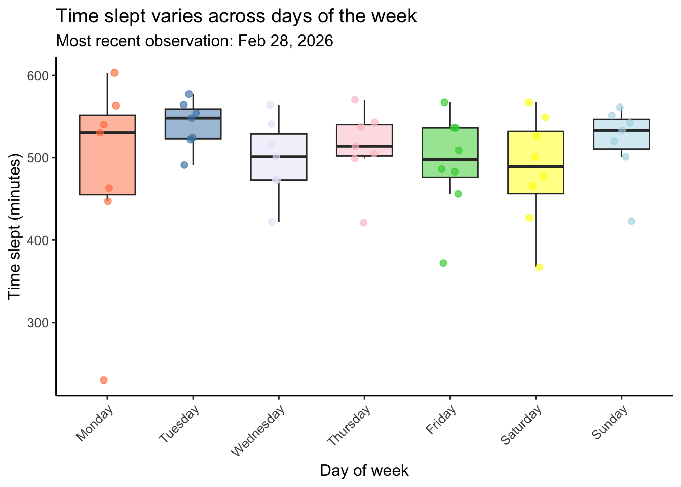
Visualization 2 (continuous predictor variable)
ggplot(data = my_data_clean, # uses cleaned data
       aes(x = sleep_efficiency, # continuous predictor (sleep efficency) on x-axis
           y = time_slept_minutes)) + # response (time slept (min)) on y-axis
  geom_point( # plots individual days
    color = "magenta4", # changes color to purple
    alpha = 0.7, # sets transparency so points are visible
    size = 2) + # sets size of points
  labs(title = "Sleep duration vs. sleep efficiency", # creates title
       subtitle = paste("Most recent observation:", # creates subtitle
                        format(most_recent_date, "%b %d, %Y")), # reformat date
       x = "Sleep Efficiency (range 0-1)", # creates x-axis label
       y = "Time slept (minutes)") + # creates y-axis label + units
  theme_classic(base_size = 12) # cleaner theme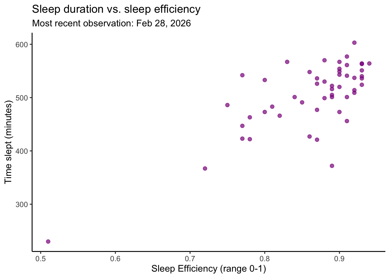
b. Captions
In text (not in code), write captions for both your figures.
Figure 1. Time slept varies across days of the week. Colored boxplots represent the distribution of daily time slept (minutes) for each day of the week (Monday–Sunday) which are each indicated with a different color (Monday is coral, Tuesday is steelblue, Wednesday is lavender, Thursday is pink, Friday is limegreen, Saturday is yellow, Sunday is lightblue). Boxes display the interquartile range (IQR), horizontal lines indicate medians, and whiskers extend to 1.5 times the IQR. Semi-transparent colored points represent individual daily observations which are jittered horizontally within each day to reduce overlap. The subtitle indicates the most recent observation included in the dataset. Data represent personal daily tracking records collected between January–February 2026 using an Oura ring.
Figure 2. Sleep duration is associated with sleep effciency (as measured by the Oura Ring). Magenta circles represent individual daily observations of time slept (minutes) plotted against sleep efficiency (ranging 0-1 with 1 indicating 100% efficiency and 0 indicating 0% efficiency). Each scatterplot point corresponds to a single recorded day. Sleep efficiency as defined by Oura is the percentage of time you were asleep while you were in bed. The subtitle indicates the most recent observation included in the dataset. Data represent personal daily tracking records collected between January–February 2026 using an Oura ring.
Problem 3. Affective visualization
In this problem, you will create an affective visualization using your personal data in preparation for workshops during weeks 9 and 10.
a. Describe in words what an affective visualization could look like for your personal data (3-5 sentences).
Inspired by warming stripes and quilt art, I could create a visualization where each day is represented by a horizontal strip arranged chronologically from top to bottom. The color of each strip would represent time stressed with the number of the hue determined by the minutes spent stressed. The opacity of each strip would represent sleep efficiency (measured as a percentage), with more opaque colors indicating higher efficiency. The length of each strip would represent time slept, so longer strips indicate more sleep. The design would mirror the strips across the center of a square layout, creating a quilt-like pattern that highlights changes/patterns in stress and sleep over time.
b. Create a sketch (on paper) of your idea.
Include a photo of this sketch in your document.
# includes sketch
knitr::include_graphics(here('data',"sketch.jpg"))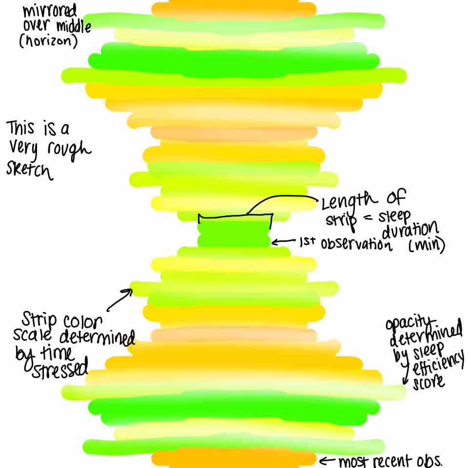
c. Make a draft of your visualization.
Feel free to be creative with this! The one rule is that you may not use any code to create your visualization.
# includes draft
knitr::include_graphics(here('data',"draft.jpeg"))
d. Write an artist statement.
An artist statement gives the audience context to understand your work. For each of the following points, write 1-3 sentences to address:
- the content of your piece (what are you showing?)
This piece visualizes my daily sleep duration and time spent stressed data arranged chronologically to reveal patterns, fluctuations, and rhythms over time. Each day is represented as a horizontal strip of color, where the hue of the color reflects the amount of time I felt stressed. The opacity of each strip represents sleep efficiency, with higher efficiency shown as more opaque colors, while the length of each strip represents the total time slept that night.
- the influences (what did techniques/artists/etc. did you find influential in creating your work?)
I was influenced by warming-strips temperature visualizations and quilt art, which use simple color gradients to communicate change over time in an intuitive and emotional way. I was also inspired by data-art projects that allow trends to be felt rather than just measured. My initial inspiration came from temperature-color blankets shared on the r/dataisbeautiful Reddit page that I saw over the past summer and really stuck with me.
- the form of your work (watercolor, oil painting, crocheted object, etc.)
My visualization will be created digitally using the Sketchbook app on my iPad.
- your process (how did you create your work?)
I plan to use a grid background (which I will later delete) to keep the spacing and lengths of the strips consistent. The sleep efficiency percentage will match the opacity of each strip with days above the mean appearing more opaque and days below the mean appearing more transparent. Each block on the grid will indicate an additional 10 minutes slept and a change in hue will be directly indicated by minutes stressed.
Problem 4. Statistical critique
At this point, you have seen and created a lot of figures for this class. Revisit the paper you chose for your critique and your homework 2, where you described figures or tables in the text. Address the following in full sentences (3-4 sentences each).
For this section of your homework, you will be evaluated on the logic, conciseness, and nuance of your critique.
a. Revisit and summarize
What are the statistical tests the authors are using to address their main research question? (Note: you have already written about this in homework 2! Find that text and provide it again here!)
The statistical test in this paper is a Kruskal–Wallis test (to compare the three treatments), followed by pairwise Mann–Whitney U-tests for post-hoc comparisons. The response variable is periphyton (primary producer) net primary production and the predictor variable is Mediterranean barbel (small endangered predator fish species) density.
Insert the figure or table you described in Homework 2 here.
# includes figure
knitr::include_graphics(here('code',"pone.0117630.g005.png"))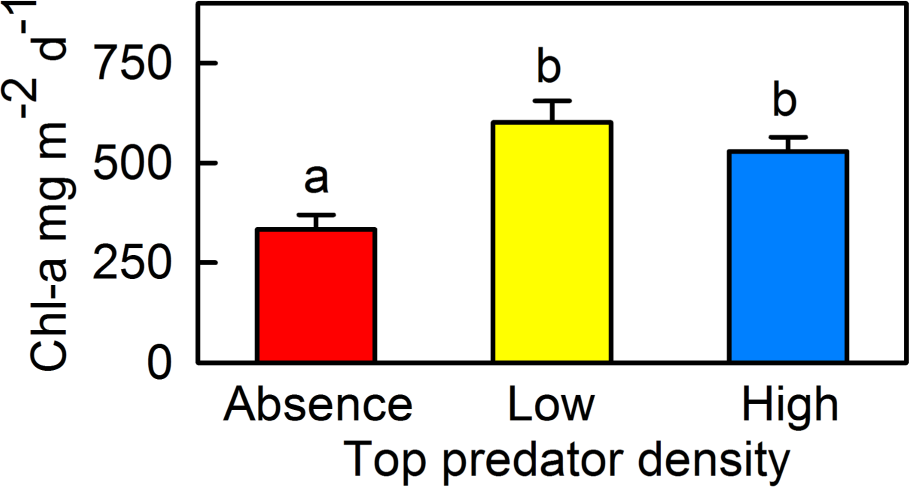
b. Visual clarity
In 2-4 sentences, answer the question.
How clearly did the authors visually represent their statistics in figures? For example, are the x- and y-axes in a logical position? Do they show summary statistics (means and SE, for example) and/or model predictions, and if so, do they show the underlying data?
The authors clearly present the primary comparison by placing predator density categories on the x-axis and chlorophyll-a concentration on the y-axis, which creates a logical and intuitive layout. The figure shows summary statistics using mean values with error bars representing standard error, and uses letter groupings (“a” = absent, “b” = barbels) to indicate statistically significant differences among treatments. While this approach communicates statistical comparisons efficiently, the figure only displays summary values and does not show the underlying data points. As a result, it is difficult to assess the distribution of observations, sample size, or the presence of potential outliers.
c. Aesthetic clarity
In 2-4 sentences, answer the question.
How well did the authors handle “visual clutter”? How would you describe the the data:ink ratio?
The figure is visually straightforward and mostly uncluttered, with minimal gridlines and clear labeling. The data-to-ink ratio is fairly high because most visual elements (bars, error bars, and treatment labels) directly represent data rather than decorative elements. However, the large filled bars dominate the visual space and emphasize area rather than the mean values themselves. The bold primary colors also create strong contrast without conveying additional information, which makes the figure slightly visually distracting despite its otherwise simple design.
d. Recommendations
In 2-4 sentences, outline what recommendations would you make to make the figure or table better. What would you take out, add, or change? Provide explanations/justifications for each of your recommendations.
I would recommend replacing the bar chart with a dot plot or boxplot that includes the underlying data points. Showing the raw observations would allow readers to assess variability, sample size, and potential outliers rather than only viewing summary statistics. Additionally, using slightly more muted colors would reduce unnecessary visual emphasis and improve accessibility without changing the meaning of the figure. Finally, explicitly labeling the y-axis or legend with what the error bars represent (SE), would make the statistical summary clearer without requiring readers to refer to the caption.